I’m probably the queen of mail apps. For some reason, no matter how cool the average mail app is, I always try my best to try out all the cool mail apps. Back in the day, I even bought Sparrow…and like a month later, unfortunately, Gmail came out with its app….so I downloaded that and stopped using Sparrow (since Sparrow had no push notifications). Anyways! Back to topic. Here’s the thing. I’m obsessed with mail apps, so I figured I’d do a bit of a compare and contrast for you all.
Mailbox – Put email in its place
I downloaded this like two days ago when I got an email from Dropbox saying I’d get an extra GB of space if I synced it to my Dropbox…..that was good enough motivation for me. I’ve been running out of space so here was a perfect solution! So, Mailbox is an iPhone/iPad app that connects to Gmail. (Which brings me to limitations #1 and #2: only iOS friendly, and only Gmail)…..Regardless, it still worked for me, b/c I happen to only have gmail accounts.
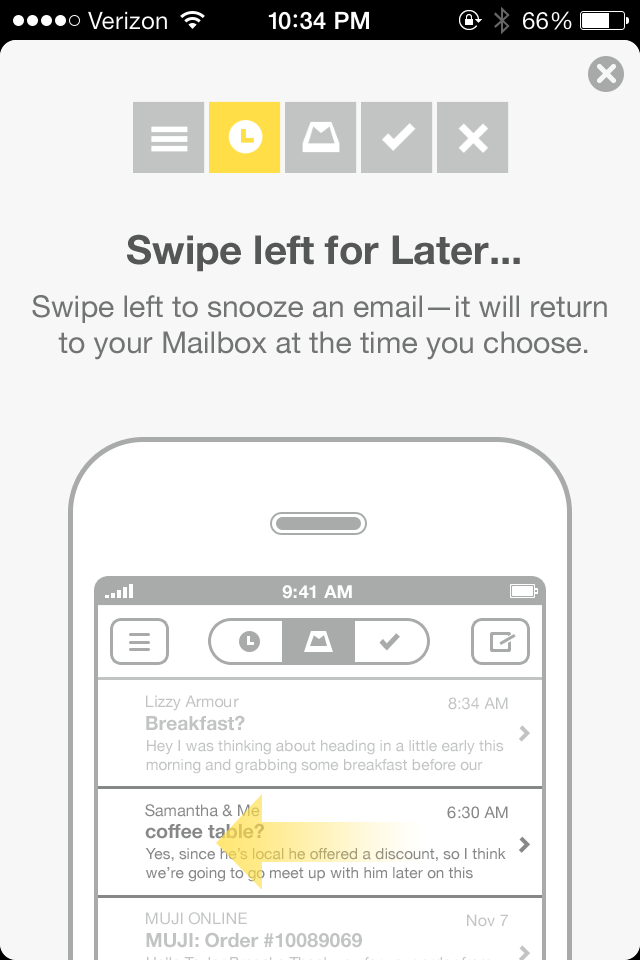
The most noticeable thing about this app is the usage of swipes. They realllllly love their swiping. Essentially there are five “zones” that you can access with corresponding swipes. So, to archive a message, swipe right. To throw it away, long swipe right. To see a message later, swipe left. And to put it in a list, long swipe left. In the beginning it’ll give you a tutorial and what not.
I’m pretty sure that the goal of this app is to get people to organize their mailboxes and get it down to zero mail in your box: either by moving stuff to lists, throwing it away, or archiving messages that are no longer needed. Another feature I noticed, which I don’t even think the Gmail app by Google has is the integration of aliases. You can send emails using any of your registered Gmail aliases. The last, and probably biggest feature I noticed of this is that the attachments link to your Dropbox. (Guess that makes sense with Dropbox giving you an extra gig of storage and what not…)

Oh! And the Snooze feature (short swipe left) is nice! The number of times I’ve flagged an email and been like, oh yeah—let’s flag this. I need to come back to it in like an hr…..and then, typical Prakriti move, I totally forget about it. So the snooze would help that out a bit. Especially since they give you choices for how long to Snooze for!

See? Lots of choices.
Even though I’ve only had this for two days, I could totally see myself being a regular user, having no emails in my inbox, and just being a pro at swiping everything that comes my way.
Pros
- Perfect for swipe-crazy people
- Usage of aliases
- Will help you clear your inbox to zero mail
- Dropbox integration for attachments
Cons
- Doesn’t have integration for the new tabs Gmail added recently (Primary, Social, Promotion, Update, etc) or labels
- Only available for iOS
- Only available for Gmail
Native iOS 7 Mail App
Alrighty, next app to investigate is the iOS 7 Mail app. (Keep in mind, I’m running this on an iPhone 4, so there is a possibility that the iPhone 5, 5s, 5c might have additional features.)
They reallllly flattened the design for this. It looks stylish, but honestly, the other two apps have more functionality. Since this app wasn’t tailor-made to Gmail, you don’t have the starring, labeling, or categorizing abilities. I guess it’s kinda cool that you can flag a mail as a color or a shape? They kinda have the swipe to delete & archive thing going on too, but really. I’m not seeing anything that’s special to Mail. Oh. Shake to undo. Previously only applicable to text, now applicable to messages in case you mistakenly delete or archive it. I guess that’s exciting! (Not quite.)

I’m actually a little bummed for Apple 😦
Pro
Available for non-gmail emails
Cons
Not tailor-made to Gmail so it’s missing…..just about everything
Gmail
So the Gmail app actually by Google has that advantage over the rest is that it’s made solely for Gmail. Hence, it has pretty much all the natural functionalities of the web-based Gmail. If you’re on an Android OS, then the app has better integration with contacts and with other apps. On iOS, it’s slightly limited but not bad. So I’ve been using the Gmail app since it came out. The first version? Oh wow, it was so horrible I couldn’t delete it fast enough. But once they bought Sparrow and updated their app, I decided to give them another chance and it was much better. There’s the plus side of being able to use labels on the Gmail app. Alternatively (which just occurred to me), if you organized the Lists in a similar manner for Mailbox, that would effectively be labeling in Gmail. The search is definitely something Google boasts about, which as far as I know, they totally have the right to, given that their search is pretty amazing…

The Gmail app has the whole categories thing set, so that’s a big reason why I would use the Gmail app over Mailbox. There’s just so much clutter going into my Social, Promotions, and Updates tabs that I don’t even want to deal with it. I’m so okay with just seeing my primary mail. Plus, I like that it only gives notifications for things in my Primary tab; everything else, it just marks “2 new” or whatever on the side panel. (Unfortunately, my screenshot doesn’t reflect that because I have no unread messages as of now.)

Oh! Attachments! You can attach pics from your phone (typical) and you can also add Scribbles!

Pros
- Labeling, made by Google
- Available for Android & iOS (and Windows Phone & Blackberry!)
- Shows Primary only in the Inbox
- Scribbles!
Cons
- Design for other apps looks a little better (in my opinion)
- Works only for Gmail (not surprisingly….)
TL;DR
Mailbox
Pros: Perfect for swipe-crazy people; usage of aliases; will help you clear your inbox to zero mail; Dropbox integration for attachments
Cons: Doesn’t have integration for the new categories Gmail added recently (Primary, Social, Promotion, Update, etc) or labels; only available for iOS; only available for Gmail
Pro: Available for non-gmail emails
Cons: Not tailor-made to Gmail so it’s missing…..just about everything
Gmail
Pros: Labeling, made by Google, available for Android & iOS (and Windows Phone & Blackberry), shows Primary only in the Inbox, Scribbles!
Cons: Design for other apps looks a little better (in my opinion), works only for Gmail (not surprisingly….)


